
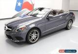
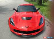
2020 Mercedes-Benz Other GLE 450
Sale type: Dealer
Technical specifications, photos and description:
| Condition: | New |
| Year: | 2020 |
| Mileage: | 13 |
| Body Type: | Sport Utility |
| Vehicle Title: | Clear |
| Options: | -- |
| Power Options: | -- |
| Manufacturer: | Mercedes-benz |
| Exterior Color: | Red |
| Sub Model: | GLE 450 |
| Interior Color: | Gray |
| Trim: | GLE 450 |
| Transmission: | Automatic |
| Drive Type: | GLE 450 4MATIC SUV |
| Warranty: | Unspecified |
| Engine: | 3.0L I6 Turbo Engine |
| Fuel Type: | Hybrid-Electric |
| Model: | Other |
| Got questions? | Ask here! |
Do you like this car?
     |
Tweet |
2020 Mercedes-Benz Other GLE 450 for sale
Current customer rating: (3) based on 5 votes


@font-face font-display:optional;font-family: "Market Sans"; font-style: normal; font-weight: 400; src: url(https://ir.ebaystatic.com/cr/v/c1/market-sans/v1.0/MarketSans-Regular-WebS.eot); src: url(https://ir.ebaystatic.com/cr/v/c1/market-sans/v1.0/MarketSans-Regular-WebS.eot?#iefix) format('embedded-opentype'),url(https://ir.ebaystatic.com/cr/v/c1/market-sans/v1.0/MarketSans-Regular-WebS.woff2) format('woff2'),url(https://ir.ebaystatic.com/cr/v/c1/market-sans/v1.0/MarketSans-Regular-WebS.woff) format('woff'),url(https://ir.ebaystatic.com/cr/v/c1/market-sans/v1.0/MarketSans-Regular-WebS.ttf) format('truetype'),url(https://ir.ebaystatic.com/cr/v/c1/market-sans/v1.0/MarketSans-Regular-WebS.svg#MarketSans-Regular-WebS) format('svg') .eb-post-container{ background-color: #fff; font-family: 'Market Sans', sans-serif; font-size: 0.9em; @media only screen and (max-width: 768px) .eb-post-container padding-bottom: 10px; .eb-post-container a{ color: #006efc; .eb-post-container .title{ font-weight: bold; margin: 10px 10px 0; font-size: 20px; /*color: #767676*/ color: #151e27; .eb-post-container .content{ margin-bottom: 10px; line-height: 20px; .eb-post-container .content p{ margin: 0!important; .eb-post-separator height: 1px; border-bottom: 1px solid #ccc; .eb-post-photos a{ cursor: pointer; .eb-post-photos img{ height: auto; width: auto; max-width: 100%; max-height: 600px; margin: auto; .eb-post-vehicle div{ padding: 10px; margin: auto; .eb-post-vehicle-title{ border-bottom: 1px solid #ccc; width: 90%; @media only screen and (max-width: 768px) .eb-post-vehicle-title border-bottom: none; border-top: 1px solid #ccc; .eb-post-vehicle-title span{ font-size: 1.6em; font-weight: bold; .eb-post-vehicle-overview{ padding: !important; width: 100%; display: table; .eb-post-vehicle-overview div{ float: left; padding: 5px 0; .eb-post-vehicle-overview div.overview-title{ text-align: right; font-weight: bold; width: 40%; .eb-post-vehicle-overview div.overview-value{ text-align: left; margin-left: 10px; width: 50%; .eb-post-mpg{ border: 1px solid #ccc; border-radius: 5px; width: 90%; overflow: auto; padding: 0; text-align: center; margin: 10px auto !important; .eb-post-mpg-details{ display: inline-block; margin: auto !important; padding: !important; .eb-post-mpg-details div{ float: left; .eb-post-mpg span{ font-size: 1.5em; font-weight: bold; .eb-post-small-silver-text{ font-size: 0.8em; color: #bbb; margin: !important; padding: !important; .clear-both{ clear: both; width: 0; height: 0; margin: !important; padding: !important; .border-bottom{ padding-bottom: 10px; margin-bottom: 10px; margin-top: 10px; .eb-post-logo{ width: 98%; margin: 1%; @media only screen and (max-width: 768px) .eb-post-logo text-align: center; .eb-post-logo img{ max-width: 100%; max-height: 150px; .eb-post-phonetracking text-align: center; width: 98%; margin: 1%; .eb-post-storelink{ text-align: center; color: #006efc !important; text-decoration: none !important; font-weight: bold !important; font-size: 14px line-height: 1.43; display: inline-block; .eb-post-viewallphotos:hover{ background: #00509d; .eb-post-phonenumber{ width: 260px; background-color: #3665f3; padding: 10px 10px 0; margin: 53px auto auto; @media only screen and (max-width: 768px) .eb-post-phonenumber margin-top: 10px; .eb-post-phonenumber span height: 24px; font-size: 20px; text-align: center; color: #ffffff; .eb-post-phonenumber height: 24px; font-size: 20px; text-align: center; color: #ffffff; text-decoration: none; .eb-post-photos{ width: 98%; margin: 1%; @media only screen and (max-width: 768px) .eb-post-photos margin: 1% 1% 10px 1%; }} .eb-post-vehicle text-align: center; width: 98%; margin: 1%; .eb-post-viewallphotos-container{ text-align: center; display: block; width: 100%; z-index: 9993; margin-top: 10px; @media only screen and (min-width: 768px) .eb-post-container{ /*border-bottom: 1px solid #ccc;*/ margin-bottom: 10px; .eb-post-container .title{ margin: 30px 10px 10px 10px; .eb-post-container .content{ margin: 10px 10px 10px; .eb-post-logo{ float: left; width: 60%; margin-right: 2%; .eb-post-phonetracking text-align: center; width: 35%; float: left; .eb-post-photos{ float: left; width: 595px; margin-right: 2%; .eb-post-vehicle{ text-align: center; float: left; width: 40%; .view-all-images{ display: block !important; .view-all-images{ display: none; margin-top: 10px; color: #3366cc; text-align: center; max-width: 640px; .view-all-images a{ text-decoration: none; width: 49%; margin: 5px 0; #div_vehicle_description{ position: relative; .wordwrap white-space: pre-wrap; /* CSS3 */ white-space: -moz-pre-wrap; /* Firefox */ white-space: -pre-wrap; /* Opera pre */ white-space: -o-pre-wrap; /* Opera */ word-wrap: break-word; /* IE */ .overlay position: fixed; top: 0; bottom: 0; left: 0; right: 0; background: rgba(0, 0, 0, 0.3); transition: opacity 500ms; visibility: hidden; opacity: 0; z-index: 9990; .overlay:target visibility: visible; opacity: 1; .popup margin: 20px auto; padding: 0; background: #fff; border-radius: 0; width: 100%; position: relative; transition: all 5s ease-in-out; .popup .close position: absolute; top: 15px; right: 15px; transition: all 200ms; font-size: 30px; font-weight: bold; text-decoration: none; color: #333; margin-top: -15px; margin-right: -10px; z-index: 9992; display: none; .popup .close:hover color: #06D85F; .popup .content max-height: 30%; overflow: auto; #popupGallery{ visibility: visible; opacity: 1; background: none; position: relative; /* .read-more-state display: none; .read-more-target opacity: 0; max-height: 0; font-size: 0; margin: !important; transition: all .25s cubic-bezier(0, 1, 0.5, 1); line-height: 0; .vehicle-options .read-more-target, .read-more-state:checked .read-more-wrap .read-more-target, .read-more-state:checked .accordion .accordion-container .accordion__content .read-more-wrap .read-more-target{ opacity: 1; line-height: 18px; font-size: inherit; max-height: 999em; .read-more-state .read-more-trigger:before content: 'More photos'; color: #3366cc; .read-more-state:checked .read-more-trigger:before content: 'Less photos'; color: #3366cc; .read-more-state .read-more-wrap .read-more-dots display: inline-block; .vehicle-options .read-more-dots, .read-more-state:checked .accordion .accordion-container .accordion__content .read-more-wrap .read-more-dots, .read-more-state:checked .read-more-wrap .read-more-dots display: none; */ .read-more-trigger /*cursor: pointer; display: inline-block; padding: .5em; color: #fff; font-size: .9em; line-height: 2; background: #00509d; background: -webkit-gradient(linear,left top,left bottom,from(#0079bc),to(#00509d)); background: -moz-linear-gradient(top,#0079bc,#00509d); border-radius: 5px; margin-top: 10px;*/ .contact-seller-box font-weight: bold; /* Accordion */ /* Basic Accordion Styles */ .accordion width: 100%; .accordion input[name='panel'] display: none; .accordion label position: relative; display: block; padding: 10px; border-bottom: 1px solid rgba(0, 0, 0, 0.15); font-weight: bold; cursor: pointer; transition: all 0.4s cubic-bezier(0.865, 0.14, 0.095, 0.87); .accordion label:after border-style: solid; border-width: 1px 1px 0; content: ''; display: inline-block; height: 0.45em; right: 1em; position: absolute; top: 1.1em; transform: rotate(-45deg); vertical-align: top; width: 0.45em; .accordion label:hover color: #fff; background-color: #3665f3; .accordion input:checked label color: #fff; background-color: #3665f3; .accordion input:checked label:after transform: rotate(135deg); .accordion .accordion__content -webkit-transition: opacity 1s ease-out; transition: height opacity 1s ease-out; overflow: hidden; opacity: 0; height: 0; position: relative; padding: 10px; border-bottom: 1px solid #ccc; font-size: 0.9em; input[name='panel']:checked .accordion__content opacity: 1; height: auto; padding: 10px; .vehicle-options{ -webkit-padding-start: 0; margin-left: 16px; .all-photos-container{ padding: 5px; text-align: center; .all-photos{ display: block; height: auto; width: auto; max-width: 100%; max-height: 600px; margin: 5px auto; .button-show-more-options{ display: none; .contactus-desktop{ display: none; .contactus-mobile{ display: block; .call-dealer{ margin-bottom: 0; @media only screen and (min-width: 768px) #popupGallery{ visibility: hidden; opacity: 0; background: rgba(0, 0, 0, 0.3); position: fixed; .overlay:target visibility: visible!important; opacity: 1!important; .popup margin: 70px auto; padding: 30px 10px 10px; border-radius: 5px; width: 640px; .popup .close display: block; .contact-seller-box .eb-post-storelink{ display: inline-block; margin: 30px; .accordion{ display: table; table-layout: fixed; border-collapse:separate; border-spacing:10px; .accordion label margin: 5px; text-align: left; cursor: default; padding:0; border: none; .accordion label:hover color: #000; background-color: #fff; .accordion input:checked label color: #000; background-color: #fff; .accordion div{ display: table-cell; border-right: 1px solid #ccc; .accordion div:last-child border:none; .accordion label:after content: ''; border: none; .accordion input:checked label:after content: ''; .accordion .accordion__content{ opacity: 1; border: none; padding: 0; input[name='panel']:checked .accordion__content padding: 0; .vehicle-options .read-more-target opacity: 0; max-height: 0; font-size: 0; margin: !important; transition: all .25s cubic-bezier(0, 1, 0.5, 1); .button-show-more-options{ display: inline-block; .vehicle-options .read-more-dots{ display: inline-block; .contactus-desktop{ display: inline-block; .contactus-mobile{ display: none; .call-dealer{ display: none !important; .read-more-trigger:not(.photo-trigger){ display: none; .read-more-dots{ display: none !important; .read-more-target:not(.photo-target){ opacity: !important; line-height: 18px !important; font-size: inherit !important; max-height: 999em !important; .photo-gallery width: 100%; .photo-gallery text-decoration: none; #slideshow position: relative; width: 595px; height: 450px; margin: 20px auto 10em; @media only screen and (max-width: 768px) #slideshow width: 100%; height: auto; margin: 10px auto; #slideshow .command position: absolute; top: 193px; width: 26px; height: 64px; display: inline-flex; flex-direction: column; justify-content: center; align-items: center; border: solid 1px #333333; background-color: rgba(255, 255, 255, 0.45); @media only screen and (max-width: 768px) #slideshow .command position: absolute; top: calc(75vw 34px); width: calc(50% 2px); height: 32px; display: inline-flex; flex-direction: column; justify-content: center; align-items: center; border: solid 1px #333333; background-color: rgba(255, 255, 255, 0.45); #slideshow .command:hover cursor: pointer; background-color: rgba(255, 255, 255, 0.8); #slideshow .command .command-icon{ border: solid #333333; border-width: 3px 3px 0; display: inline-block; padding: 6px; #slideshow .prev.command left: 0; #slideshow .prev.command .command-icon transform: rotate(135deg); -webkit-transform: rotate(135deg); margin-left: 6px; #slideshow .next.command right: 0; #slideshow .next.command .command-icon transform: rotate(-45deg); -webkit-transform: rotate(-45deg); margin-right: 6px; #slideshow .prev, #slideshow .next display:none; z-index: 9; #slideshow .container position:relative; width: 595px; height: 450px; overflow: hidden; @media only screen and (max-width: 768px) #slideshow .container width: 100%; height: 75vw; #slideshow .slider-placeholder position: absolute; left:0; top:0; width: 2200%; height: 450px; font-size:0; white-space: nowrap; display: flex; #slideshow .slider-placeholder .photo-container /*height: 450px;*/ width: 595px; display: inline-flex; flex-direction: column; justify-content: center; align-items: center; overflow: hidden; background: #ffffff; #slideshow .slider-placeholder img display: block; width: 100%; max-height: none; @media only screen and (max-width: 768px) #slideshow .slider-placeholder width: 2200vw; height: 75vw; #slideshow .slider-placeholder img height: 75vw; width: 100vw; display: inline-block; #slideshow .slider-placeholder -webkit-transition: all 1s; -moz-transition: all 1s; transition: all 1s; .thumbnail-list position: relative; top: 10px; padding:0; margin:0; width: 100%; overflow-x: hidden; font-size: 0; .thumbnail-list .thumbnail-list-wrapper white-space: nowrap; overflow-x: visible; -webkit-transition: all 1s; -moz-transition: all 1s; transition: all 1s; display: flex; flex-direction: row; justify-content: center; align-items: center; @media only screen and (max-width: 768px) .thumbnail-list display: none; .thumbnail-list .thumbnail-item display: inline-block; .thumbnail-list .thumbnail display:inline-block; padding:0; margin:0; list-style:none; height: 80px; width: 80px; box-sizing: border-box; border: 1px solid transparent; .thumbnail-list .thumbnail-item margin-left: -1px; .thumbnail-list .thumbnail-item:first-child margin-left: 0; .thumbnail-list .thumbnail .photo-container width: 100%; height: 59px; display: flex; flex-direction: column; justify-content: center; align-items: center; overflow: hidden; margin-top: 10px; background: #ffffff; .thumbnail-list .thumbnail img width: 100%; display: block; .thumbnail-list .thumbnail:hover border: 1px solid #006efc; .thumbnail-list .link-btn display: inline-block; background-color: transparent; border: 1px solid #3366cc; border-radius: 5px; line-height: 20px; margin-left: 5px; padding: 10px; text-align: center; text-decoration: none; white-space: nowrap; font-size: 12px; .sl_anchor display: none; .slide-status margin-top: 10px; @media only screen and (max-width: 768px) .slide-status padding: 16px; .slide-status .current-page display: none; margin-right: 6px; .slide-status .sum margin-left: 6px; .slide-status .statistic display: inline-block; font-family: Roboto; font-size: 12px; font-weight: normal; font-style: normal; font-stretch: normal; line-height: normal; letter-spacing: normal; color: #767676; .slide-status .outer-link float: right; color: #006efc; font-size: 12px; #slideshow .command { display: none; .sl_anchor:nth-of-type(1):checked #slideshow .command-group1 { display: inline-flex; .sl_anchor:nth-of-type(1):checked #slideshow .slider-placeholder transform: translateX(-0px);} @media only screen and (max-width: 768px) .sl_anchor:nth-of-type(1):checked #slideshow .slider-placeholder transform: translateX(-0vw);} .sl_anchor:nth-of-type(1):checked #slideshow .thumbnail-list .thumbnail-item:nth-of-type(1) .thumbnail border: 1px solid #006efc; .sl_anchor:nth-of-type(1):checked #slideshow .thumbnail-list .thumbnail-item:nth-of-type(1) .thumbnail .photo-container{ margin-top: 7px; .sl_anchor:nth-of-type(1):checked #slideshow .thumbnail-list.auto-scroll .thumbnail-list-wrapper margin-left: 0; .sl_anchor:nth-of-type(1):checked #slideshow .slide-status .current-page:nth-of-type(1) display: inline; .sl_anchor:nth-of-type(2):checked #slideshow .command-group2 { display: inline-flex; .sl_anchor:nth-of-type(2):checked #slideshow .slider-placeholder transform: translateX(-595px);} @media only screen and (max-width: 768px) .sl_anchor:nth-of-type(2):checked #slideshow .slider-placeholder transform: translateX(-100vw);} .sl_anchor:nth-of-type(2):checked #slideshow .thumbnail-list .thumbnail-item:nth-of-type(2) .thumbnail border: 1px solid #006efc; .sl_anchor:nth-of-type(2):checked #slideshow .thumbnail-list .thumbnail-item:nth-of-type(2) .thumbnail .photo-container{ margin-top: 7px; .sl_anchor:nth-of-type(2):checked #slideshow .thumbnail-list.auto-scroll .thumbnail-list-wrapper margin-left: 0; .sl_anchor:nth-of-type(2):checked #slideshow .slide-status .current-page:nth-of-type(2) display: inline; .sl_anchor:nth-of-type(3):checked #slideshow .command-group3 { display: inline-flex; .sl_anchor:nth-of-type(3):checked #slideshow .slider-placeholder transform: translateX(-1190px);} @media only screen and (max-width: 768px) .sl_anchor:nth-of-type(3):checked #slideshow .slider-placeholder transform: translateX(-200vw);} .sl_anchor:nth-of-type(3):checked #slideshow .thumbnail-list .thumbnail-item:nth-of-type(3) .thumbnail border: 1px solid #006efc; .sl_anchor:nth-of-type(3):checked #slideshow .thumbnail-list .thumbnail-item:nth-of-type(3) .thumbnail .photo-container{ margin-top: 7px; .sl_anchor:nth-of-type(3):checked #slideshow .thumbnail-list.auto-scroll .thumbnail-list-wrapper margin-left: 0; .sl_anchor:nth-of-type(3):checked #slideshow .slide-status .current-page:nth-of-type(3) display: inline; .sl_anchor:nth-of-type(4):checked #slideshow .command-group4 { display: inline-flex; .sl_anchor:nth-of-type(4):checked #slideshow .slider-placeholder transform: translateX(-1785px);} @media only screen and (max-width: 768px) .sl_anchor:nth-of-type(4):checked #slideshow .slider-placeholder transform: translateX(-300vw);} .sl_anchor:nth-of-type(4):checked #slideshow .thumbnail-list .thumbnail-item:nth-of-type(4) .thumbnail border: 1px solid #006efc; .sl_anchor:nth-of-type(4):checked #slideshow .thumbnail-list .thumbnail-item:nth-of-type(4) .thumbnail .photo-container{ margin-top: 7px; .sl_anchor:nth-of-type(4):checked #slideshow .thumbnail-list.auto-scroll .thumbnail-list-wrapper margin-left: 0; .sl_anchor:nth-of-type(4):checked #slideshow .slide-status .current-page:nth-of-type(4) display: inline; .sl_anchor:nth-of-type(5):checked #slideshow .command-group5 { display: inline-flex; .sl_anchor:nth-of-type(5):checked #slideshow .slider-placeholder transform: translateX(-2380px);} @media only screen and (max-width: 768px) .sl_anchor:nth-of-type(5):checked #slideshow .slider-placeholder transform: translateX(-400vw);} .sl_anchor:nth-of-type(5):checked #slideshow .thumbnail-list .thumbnail-item:nth-of-type(5) .thumbnail border: 1px solid #006efc; .sl_anchor:nth-of-type(5):checked #slideshow .thumbnail-list .thumbnail-item:nth-of-type(5) .thumbnail .photo-container{ margin-top: 7px; .sl_anchor:nth-of-type(5):checked #slideshow .thumbnail-list.auto-scroll .thumbnail-list-wrapper margin-left: -40px; .sl_anchor:nth-of-type(5):checked #slideshow .slide-status .current-page:nth-of-type(5) display: inline; .sl_anchor:nth-of-type(6):checked #slideshow .command-group6 { display: inline-flex; .sl_anchor:nth-of-type(6):checked #slideshow .slider-placeholder transform: translateX(-2975px);} @media only screen and (max-width: 768px) .sl_anchor:nth-of-type(6):checked #slideshow .slider-placeholder transform: translateX(-500vw);} .sl_anchor:nth-of-type(6):checked #slideshow .thumbnail-list .thumbnail-item:nth-of-type(6) .thumbnail border: 1px solid #006efc; .sl_anchor:nth-of-type(6):checked #slideshow .thumbnail-list .thumbnail-item:nth-of-type(6) .thumbnail .photo-container{ margin-top: 7px; .sl_anchor:nth-of-type(6):checked #slideshow .thumbnail-list.auto-scroll .thumbnail-list-wrapper margin-left: -120px; .sl_anchor:nth-of-type(6):checked #slideshow .slide-status .current-page:nth-of-type(6) display: inline; .sl_anchor:nth-of-type(7):checked #slideshow .command-group7 { display: inline-flex; .sl_anchor:nth-of-type(7):checked #slideshow .slider-placeholder transform: translateX(-3570px);} @media only screen and (max-width: 768px) .sl_anchor:nth-of-type(7):checked #slideshow .slider-placeholder transform: translateX(-600vw);} .sl_anchor:nth-of-type(7):checked #slideshow .thumbnail-list .thumbnail-item:nth-of-type(7) .thumbnail border: 1px solid #006efc; .sl_anchor:nth-of-type(7):checked #slideshow .thumbnail-list .thumbnail-item:nth-of-type(7) .thumbnail .photo-container{ margin-top: 7px; .sl_anchor:nth-of-type(7):checked #slideshow .thumbnail-list.auto-scroll .thumbnail-list-wrapper margin-left: -200px; .sl_anchor:nth-of-type(7):checked #slideshow .slide-status .current-page:nth-of-type(7) display: inline; .sl_anchor:nth-of-type(8):checked #slideshow .command-group8 { display: inline-flex; .sl_anchor:nth-of-type(8):checked #slideshow .slider-placeholder transform: translateX(-4165px);} @media only screen and (max-width: 768px) .sl_anchor:nth-of-type(8):checked #slideshow .slider-placeholder transform: translateX(-700vw);} .sl_anchor:nth-of-type(8):checked #slideshow .thumbnail-list .thumbnail-item:nth-of-type(8) .thumbnail border: 1px solid #006efc; .sl_anchor:nth-of-type(8):checked #slideshow .thumbnail-list .thumbnail-item:nth-of-type(8) .thumbnail .photo-container{ margin-top: 7px; .sl_anchor:nth-of-type(8):checked #slideshow .thumbnail-list.auto-scroll .thumbnail-list-wrapper margin-left: -280px; .sl_anchor:nth-of-type(8):checked #slideshow .slide-status .current-page:nth-of-type(8) display: inline; .sl_anchor:nth-of-type(9):checked #slideshow .command-group9 { display: inline-flex; .sl_anchor:nth-of-type(9):checked #slideshow .slider-placeholder transform: translateX(-4760px);} @media only screen and (max-width: 768px) .sl_anchor:nth-of-type(9):checked #slideshow .slider-placeholder transform: translateX(-800vw);} .sl_anchor:nth-of-type(9):checked #slideshow .thumbnail-list .thumbnail-item:nth-of-type(9) .thumbnail border: 1px solid #006efc; .sl_anchor:nth-of-type(9):checked #slideshow .thumbnail-list .thumbnail-item:nth-of-type(9) .thumbnail .photo-container{ margin-top: 7px; .sl_anchor:nth-of-type(9):checked #slideshow .thumbnail-list.auto-scroll .thumbnail-list-wrapper margin-left: -360px; .sl_anchor:nth-of-type(9):checked #slideshow .slide-status .current-page:nth-of-type(9) display: inline; .sl_anchor:nth-of-type(10):checked #slideshow .command-group10 { display: inline-flex; .sl_anchor:nth-of-type(10):checked #slideshow .slider-placeholder transform: translateX(-5355px);} @media only screen and (max-width: 768px) .sl_anchor:nth-of-type(10):checked #slideshow .slider-placeholder transform: translateX(-900vw);} .sl_anchor:nth-of-type(10):checked #slideshow .thumbnail-list .thumbnail-item:nth-of-type(10) .thumbnail border: 1px solid #006efc; .sl_anchor:nth-of-type(10):checked #slideshow .thumbnail-list .thumbnail-item:nth-of-type(10) .thumbnail .photo-container{ margin-top: 7px; .sl_anchor:nth-of-type(10):checked #slideshow .thumbnail-list.auto-scroll .thumbnail-list-wrapper margin-left: -440px; .sl_anchor:nth-of-type(10):checked #slideshow .slide-status .current-page:nth-of-type(10) display: inline; .sl_anchor:nth-of-type(11):checked #slideshow .command-group11 { display: inline-flex; .sl_anchor:nth-of-type(11):checked #slideshow .slider-placeholder transform: translateX(-5950px);} @media only screen and (max-width: 768px) .sl_anchor:nth-of-type(11):checked #slideshow .slider-placeholder transform: translateX(-1000vw);} .sl_anchor:nth-of-type(11):checked #slideshow .thumbnail-list .thumbnail-item:nth-of-type(11) .thumbnail border: 1px solid #006efc; .sl_anchor:nth-of-type(11):checked #slideshow .thumbnail-list .thumbnail-item:nth-of-type(11) .thumbnail .photo-container{ margin-top: 7px; .sl_anchor:nth-of-type(11):checked #slideshow .thumbnail-list.auto-scroll .thumbnail-list-wrapper margin-left: -520px; .sl_anchor:nth-of-type(11):checked #slideshow .slide-status .current-page:nth-of-type(11) display: inline; .sl_anchor:nth-of-type(12):checked #slideshow .command-group12 { display: inline-flex; .sl_anchor:nth-of-type(12):checked #slideshow .slider-placeholder transform: translateX(-6545px);} @media only screen and (max-width: 768px) .sl_anchor:nth-of-type(12):checked #slideshow .slider-placeholder transform: translateX(-1100vw);} .sl_anchor:nth-of-type(12):checked #slideshow .thumbnail-list .thumbnail-item:nth-of-type(12) .thumbnail border: 1px solid #006efc; .sl_anchor:nth-of-type(12):checked #slideshow .thumbnail-list .thumbnail-item:nth-of-type(12) .thumbnail .photo-container{ margin-top: 7px; .sl_anchor:nth-of-type(12):checked #slideshow .thumbnail-list.auto-scroll .thumbnail-list-wrapper margin-left: -600px; .sl_anchor:nth-of-type(12):checked #slideshow .slide-status .current-page:nth-of-type(12) display: inline; .sl_anchor:nth-of-type(13):checked #slideshow .command-group13 { display: inline-flex; .sl_anchor:nth-of-type(13):checked #slideshow .slider-placeholder transform: translateX(-7140px);} @media only screen and (max-width: 768px) .sl_anchor:nth-of-type(13):checked #slideshow .slider-placeholder transform: translateX(-1200vw);} .sl_anchor:nth-of-type(13):checked #slideshow .thumbnail-list .thumbnail-item:nth-of-type(13) .thumbnail border: 1px solid #006efc; .sl_anchor:nth-of-type(13):checked #slideshow .thumbnail-list .thumbnail-item:nth-of-type(13) .thumbnail .photo-container{ margin-top: 7px; .sl_anchor:nth-of-type(13):checked #slideshow .thumbnail-list.auto-scroll .thumbnail-list-wrapper margin-left: -680px; .sl_anchor:nth-of-type(13):checked #slideshow .slide-status .current-page:nth-of-type(13) display: inline; .sl_anchor:nth-of-type(14):checked #slideshow .command-group14 { display: inline-flex; .sl_anchor:nth-of-type(14):checked #slideshow .slider-placeholder transform: translateX(-7735px);} @media only screen and (max-width: 768px) .sl_anchor:nth-of-type(14):checked #slideshow .slider-placeholder transform: translateX(-1300vw);} .sl_anchor:nth-of-type(14):checked #slideshow .thumbnail-list .thumbnail-item:nth-of-type(14) .thumbnail border: 1px solid #006efc; .sl_anchor:nth-of-type(14):checked #slideshow .thumbnail-list .thumbnail-item:nth-of-type(14) .thumbnail .photo-container{ margin-top: 7px; .sl_anchor:nth-of-type(14):checked #slideshow .thumbnail-list.auto-scroll .thumbnail-list-wrapper margin-left: -760px; .sl_anchor:nth-of-type(14):checked #slideshow .slide-status .current-page:nth-of-type(14) display: inline; .sl_anchor:nth-of-type(15):checked #slideshow .command-group15 { display: inline-flex; .sl_anchor:nth-of-type(15):checked #slideshow .slider-placeholder transform: translateX(-8330px);} @media only screen and (max-width: 768px) .sl_anchor:nth-of-type(15):checked #slideshow .slider-placeholder transform: translateX(-1400vw);} .sl_anchor:nth-of-type(15):checked #slideshow .thumbnail-list .thumbnail-item:nth-of-type(15) .thumbnail border: 1px solid #006efc; .sl_anchor:nth-of-type(15):checked #slideshow .thumbnail-list .thumbnail-item:nth-of-type(15) .thumbnail .photo-container{ margin-top: 7px; .sl_anchor:nth-of-type(15):checked #slideshow .thumbnail-list.auto-scroll .thumbnail-list-wrapper margin-left: -840px; .sl_anchor:nth-of-type(15):checked #slideshow .slide-status .current-page:nth-of-type(15) display: inline; .sl_anchor:nth-of-type(16):checked #slideshow .command-group16 { display: inline-flex; .sl_anchor:nth-of-type(16):checked #slideshow .slider-placeholder transform: translateX(-8925px);} @media only screen and (max-width: 768px) .sl_anchor:nth-of-type(16):checked #slideshow .slider-placeholder transform: translateX(-1500vw);} .sl_anchor:nth-of-type(16):checked #slideshow .thumbnail-list .thumbnail-item:nth-of-type(16) .thumbnail border: 1px solid #006efc; .sl_anchor:nth-of-type(16):checked #slideshow .thumbnail-list .thumbnail-item:nth-of-type(16) .thumbnail .photo-container{ margin-top: 7px; .sl_anchor:nth-of-type(16):checked #slideshow .thumbnail-list.auto-scroll .thumbnail-list-wrapper margin-left: -920px; .sl_anchor:nth-of-type(16):checked #slideshow .slide-status .current-page:nth-of-type(16) display: inline; .sl_anchor:nth-of-type(17):checked #slideshow .command-group17 { display: inline-flex; .sl_anchor:nth-of-type(17):checked #slideshow .slider-placeholder transform: translateX(-9520px);} @media only screen and (max-width: 768px) .sl_anchor:nth-of-type(17):checked #slideshow .slider-placeholder transform: translateX(-1600vw);} .sl_anchor:nth-of-type(17):checked #slideshow .thumbnail-list .thumbnail-item:nth-of-type(17) .thumbnail border: 1px solid #006efc; .sl_anchor:nth-of-type(17):checked #slideshow .thumbnail-list .thumbnail-item:nth-of-type(17) .thumbnail .photo-container{ margin-top: 7px; .sl_anchor:nth-of-type(17):checked #slideshow .thumbnail-list.auto-scroll .thumbnail-list-wrapper margin-left: -1000px; .sl_anchor:nth-of-type(17):checked #slideshow .slide-status .current-page:nth-of-type(17) display: inline; .sl_anchor:nth-of-type(18):checked #slideshow .command-group18 { display: inline-flex; .sl_anchor:nth-of-type(18):checked #slideshow .slider-placeholder transform: translateX(-10115px);} @media only screen and (max-width: 768px) .sl_anchor:nth-of-type(18):checked #slideshow .slider-placeholder transform: translateX(-1700vw);} .sl_anchor:nth-of-type(18):checked #slideshow .thumbnail-list .thumbnail-item:nth-of-type(18) .thumbnail border: 1px solid #006efc; .sl_anchor:nth-of-type(18):checked #slideshow .thumbnail-list .thumbnail-item:nth-of-type(18) .thumbnail .photo-container{ margin-top: 7px; .sl_anchor:nth-of-type(18):checked #slideshow .thumbnail-list.auto-scroll .thumbnail-list-wrapper margin-left: -1080px; .sl_anchor:nth-of-type(18):checked #slideshow .slide-status .current-page:nth-of-type(18) display: inline; .sl_anchor:nth-of-type(19):checked #slideshow .command-group19 { display: inline-flex; .sl_anchor:nth-of-type(19):checked #slideshow .slider-placeholder transform: translateX(-10710px);} @media only screen and (max-width: 768px) .sl_anchor:nth-of-type(19):checked #slideshow .slider-placeholder transform: translateX(-1800vw);} .sl_anchor:nth-of-type(19):checked #slideshow .thumbnail-list .thumbnail-item:nth-of-type(19) .thumbnail border: 1px solid #006efc; .sl_anchor:nth-of-type(19):checked #slideshow .thumbnail-list .thumbnail-item:nth-of-type(19) .thumbnail .photo-container{ margin-top: 7px; .sl_anchor:nth-of-type(19):checked #slideshow .thumbnail-list.auto-scroll .thumbnail-list-wrapper margin-left: -1160px; .sl_anchor:nth-of-type(19):checked #slideshow .slide-status .current-page:nth-of-type(19) display: inline; .sl_anchor:nth-of-type(20):checked #slideshow .command-group20 { display: inline-flex; .sl_anchor:nth-of-type(20):checked #slideshow .slider-placeholder transform: translateX(-11305px);} @media only screen and (max-width: 768px) .sl_anchor:nth-of-type(20):checked #slideshow .slider-placeholder transform: translateX(-1900vw);} .sl_anchor:nth-of-type(20):checked #slideshow .thumbnail-list .thumbnail-item:nth-of-type(20) .thumbnail border: 1px solid #006efc; .sl_anchor:nth-of-type(20):checked #slideshow .thumbnail-list .thumbnail-item:nth-of-type(20) .thumbnail .photo-container{ margin-top: 7px; .sl_anchor:nth-of-type(20):checked #slideshow .thumbnail-list.auto-scroll .thumbnail-list-wrapper margin-left: -1240px; .sl_anchor:nth-of-type(20):checked #slideshow .slide-status .current-page:nth-of-type(20) display: inline; .sl_anchor:nth-of-type(21):checked #slideshow .command-group21 { display: inline-flex; .sl_anchor:nth-of-type(21):checked #slideshow .slider-placeholder transform: translateX(-11900px);} @media only screen and (max-width: 768px) .sl_anchor:nth-of-type(21):checked #slideshow .slider-placeholder transform: translateX(-2000vw);} .sl_anchor:nth-of-type(21):checked #slideshow .thumbnail-list .thumbnail-item:nth-of-type(21) .thumbnail border: 1px solid #006efc; .sl_anchor:nth-of-type(21):checked #slideshow .thumbnail-list .thumbnail-item:nth-of-type(21) .thumbnail .photo-container{ margin-top: 7px; .sl_anchor:nth-of-type(21):checked #slideshow .thumbnail-list.auto-scroll .thumbnail-list-wrapper margin-left: -1320px; .sl_anchor:nth-of-type(21):checked #slideshow .slide-status .current-page:nth-of-type(21) display: inline; .sl_anchor:nth-of-type(22):checked #slideshow .command-group22 { display: inline-flex; .sl_anchor:nth-of-type(22):checked #slideshow .slider-placeholder transform: translateX(-12495px);} @media only screen and (max-width: 768px) .sl_anchor:nth-of-type(22):checked #slideshow .slider-placeholder transform: translateX(-2100vw);} .sl_anchor:nth-of-type(22):checked #slideshow .thumbnail-list .thumbnail-item:nth-of-type(22) .thumbnail border: 1px solid #006efc; .sl_anchor:nth-of-type(22):checked #slideshow .thumbnail-list .thumbnail-item:nth-of-type(22) .thumbnail .photo-container{ margin-top: 7px; .sl_anchor:nth-of-type(22):checked #slideshow .thumbnail-list.auto-scroll .thumbnail-list-wrapper margin-left: -1400px; .sl_anchor:nth-of-type(22):checked #slideshow .slide-status .current-page:nth-of-type(22) display: inline; .lg-only, .sm-only, .lg-only-inline, .sm-only-inline display:none; @media only screen and (min-width: 768px) .lg-only{ display:block .lg-only-inline display: inline-block; @media only screen and (max-width: 768px) .sm-only{ display:block; .sm-only-inline display: inline-block; .cgg-blue color: #006efc; .cgg-gray color: #767676; a.cgg-btn border: 1px solid #000; box-sizing: border-box; font-size: .8rem; margin-left: 3px; text-align: center; text-decoration: none; vertical-align: bottom; background-color: #fff; border-radius: 0; display: inline-block; max-width: 100%; padding: 10px 5px; .cgg-btn__cell color: #000; -webkit-box-align: center; align-items: center; display: -webkit-box; display: flex; width: 100%; -webkit-box-pack: center; justify-content: center; .cgg-btn__icon:last-child, .details__icon margin-left: 8px; svg.cgg-btn__icon stroke-width: 0; flex-shrink: 0; height: 10px; width: 9.75px; .details__icon svg, svg.cgg-btn__icon fill: #000; stroke: #000; svg:not(:root) overflow: hidden; .cgg-details -webkit-box-align: center; align-items: center; -webkit-box-sizing: border-box; box-sizing: border-box; color: #3665f3; cursor: default; /*display: inline-block;*/ list-style-position: inside; list-style-type: none; padding: 14px 8px; width: 100%; .cgg-details text-decoration: none; .cgg-details:hover{ color: #000; .cgg-details-icon margin-left: 8px; .cgg-details-icon:not([hidden]) background-repeat: no-repeat; display: inline-block; vertical-align: middle; background-image: url(data:image/svg+xml;base64,PHN2ZyB4bWxucz0iaHR0cDovL3d3dy53My5vcmcvMjAwMC9zdmciIHhtbG5zOnhsaW5rPSJodHRwOi8vd3d3LnczLm9yZy8xOTk5L3hsaW5rIiB3aWR0aD0iMjEuNiIgaGVpZ2h0PSIxMi41OCIgdmlld0JveD0iMS4zNSA1LjcgMjEuNiAxMi41OCI+PHBhdGggZmlsbD0iIzM2NjVGMyIgZD0iTTEyLjE4NiAxOC4yODVjLS40NTEtLjAwOS0uODA5LS4xNjctMS4wNzUtLjQ0MWwtOS4zMzctOS42YTEuNTI3IDEuNTI3IDAgMCAxLS40MjQtLjk5OXYtLjEwOGMuMDE1LS4zODYuMTY2LS43NDEuNDI0LTEuMDA4LjU2LS41NzMgMS41MjktLjU3IDIuMDgyIDBsOC4yOTQgOC41MyA4LjI5Mi04LjUzMmMuNTU4LS41NyAxLjUyNi0uNTcgMi4wOCAwIC4yNjUuMjcuNDE2LjYyOS40MjggMS4wMXYuMDg3Yy0uMDEyLjM5MS0uMTY1Ljc1LS40MjcgMS4wMmwtOS4zMzMgOS42YTEuNDQzIDEuNDQzIDAgMCAxLTEuMDA0LjQ0MSIvPjwvc3ZnPg==); height: 5.2px; width: 9px; background-size: 9px 5.2px; .cgg-details-icon-down -webkit-transform: rotate(180deg); transform: rotate(180deg); .cgg-more-div, .cgg-less-div margin: 10px auto 20px auto; text-align: center .cgg-less-div display: none; .cgg-veh-eq-less height: 96px; overflow: hidden; display: block; @media only screen and (max-width: 768px) .cgg-details padding-left: 0; .cgg-veh-eq-less.cgg-reverse height: auto; overflow: auto; .cgg-more-div, .cgg-less-div text-align: left; .cgg-veh-eq-more display: none; .cgg-veh-eq-less:target, .cgg-veh-eq-less:target .cgg-more-div display: none; .cgg-veh-eq-less:target .cgg-veh-eq-more, .cgg-veh-eq-less:target .cgg-veh-eq-more .cgg-less-div display: block; .cgg-veh-eq-more:target display: none; .cgg-phone-num text-decoration: none; color: #006efc; font-weight: bold; 888-255-4580888-255-4580 12345678910111213141516171819202122of22 Full size photos Full size photos GLE-450 Stock #: A10170 Exterior Color: designo Cardinal Red Metallic Interior Color: Macchiato/Magmagrey Body Type: SUV Transmission: Automatic Fuel Type: Gas/Electric Hybrid Engine: 3.0L I6 Turbo Engine Title Condition: Clear City 19 mpg Hwy 24 mpg Actual mileage will vary with options, driving conditions and driving habits. Vehicle Description Mercedes Benz Of Arrowhead is excited to offer this 2020 Mercedes-Benz GLE 450. This Mercedes-Benz includes: TRAILER HITCH Tow Hitch MB-TEX DASHBOARD 3RD ROW SEAT PACKAGE 3rd Row Seat Auxiliary Audio Input MP3 Player DESIGNO HIGH-GLOSS BROWN FLOWING LINES LINDEN TRIM Woodgrain Interior Trim PANORAMA SLIDING SUNROOF Panoramic Roof Generic Sun/Moonroof Sun/Moonroof Dual Moonroof AMG LINE EXTERIOR Running Boards/Side Steps CHROME DOOR HANDLE INSERTS (PIO) *PRICE TO FOLLOW* HEATED STEERING WHEEL Heated Steering Wheel PREMIUM PACKAGE HD Radio Satellite Radio Premium Sound System PARKING ASSIST PACKAGE Back-Up Camera BURMESTER SURROUND SOUND SYSTEM Premium Sound System NIGHT PACKAGE SILVER WHEEL LOCKING BOLTS (PIO) *PRICE TO FOLLOW* Wheel Locks ILLUMINATED STAR (PIO) *PRICE TO FOLLOW* LOAD SILL PROTECTION (PIO) *PRICE TO FOLLOW* MBUX TECHNOLOGY PACKAGE Navigation System Heads-Up Display HEATED REAR SEATS Heated Rear Seat(s) *Note For third party subscriptions or services, please contact the dealer for more information.* Want more room? Want more style? This Mercedes-Benz GLE 450 is the vehicle for you. Pull up in the vehicle and the valet will want to parked on the front row. This Mercedes-Benz GLE 450 is the vehicle others dream to own. Don't miss your chance to make it your new ride. Enjoy driving? Well now you will get more thrills behind the wheel thanks to the heightened performance of AWD. Better handling. Better traction. Better driving experience. Put away your phone and focus on the road, your new vehicle has navigation. More description Mercedes Benz Of Arrowhead is excited to offer this 2020 Mercedes-Benz GLE 450. This Mercedes-Benz includes: TRAILER HITCH Tow Hitch MB-TEX DASHBOARD 3RD ROW SEAT PACKAGE 3rd Row Seat Auxiliary Audio Input MP3 Player DESIGNO HIGH-GLOSS BROWN FLOWING LINES LINDEN TRIM Woodgrain Interior Trim PANORAMA SLIDING SUNROOF Panoramic Roof Generic Sun/Moonroof Sun/Moonroof Dual Moonroof AMG LINE EXTERIOR Running Boards/Side Steps CHROME DOOR HANDLE INSERTS (PIO) *PRICE TO FOLLOW* HEATED STEERING WHEEL Heated Steering Wheel PREMIUM PACKAGE HD Radio Satellite Radio Premium Sound System PARKING ASSIST PACKAGE Back-Up Camera BURMESTER SURROUND SOUND SYSTEM Premium Sound System NIGHT PACKAGE SILVER WHEEL LOCKING BOLTS (PIO) *PRICE TO FOLLOW* Wheel Locks ILLUMINATED STAR (PIO) *PRICE TO FOLLOW* LOAD SILL PROTECTION (PIO) *PRICE TO FOLLOW* MBUX TECHNOLOGY PACKAGE Navigation System Heads-Up Display HEATED REAR SEATS Heated Rear Seat(s) *Note For third party subscriptions or services, please contact the dealer for more information.* Want more room? Want more style? This Mercedes-Benz GLE 450 is the vehicle for you. Pull up in the vehicle and the valet will want to parked on the front row. This Mercedes-Benz GLE 450 is the vehicle others dream to own. Don't miss your chance to make it your new ride. Enjoy driving? Well now you will get more thrills behind the wheel thanks to the heightened performance of AWD. Better handling. Better traction. Better driving experience. Put away your phone and focus on the road, your new vehicle has navigation. Less description Vehicle Equipment Exterior FeaturesAluminum Side Windows Trim and Black Front Windshield TrimBlack Bodyside Cladding and Black Wheel Well TrimBody-Colored Door HandlesBody-Colored Front Bumper w/Metal-Look Rub Strip/Fascia AccentBody-Colored Power Heated Side Mirrors w/Driver Auto Dimming, Power Folding and Turn Signal IndicatorBody-Colored Rear Bumper w/Black Rub Strip/Fascia Accent and Metal-Look Bumper InsertChrome GrilleClearcoat PaintCompact Spare Tire Mounted Inside Under CargoDeep Tinted GlassExpress Open/Close Sliding And Tilting Glass 1st Row Sunroof w/SunshadeFixed Rear Window w/Fixed Interval Wiper, Heated Wiper Park and DefrosterFully Automatic Projector Beam Led Low/High Beam Daytime Running Headlamps w/Delay-OffFully Galvanized Steel PanelsLED BrakelightsLip SpoilerPerimeter/Approach LightsPower Liftgate Rear Cargo AccessRear Fog LampsRoof Rack Rails OnlySpeed Sensitive Rain Detecting Fixed Interval WipersSteel Spare WheelTailgate/Rear Door Lock Included w/Power Door LocksTires: 255/50R19 ASWheels: 19" Twin 5-Spoke Interior Features2 Seatback Storage Pockets4 12V DC Power Outlets40-20-40 Folding Split-Bench Front Facing Manual Reclining Flip Forward Cushion/Seatback Rear Seat4-Way Lumbar Support8-Way Driver Seat8-Way Passenger SeatAir FiltrationAndroid AutoApple CarPlayAshtrayCargo Area Concealed StorageCargo Space LightsCarpet Floor Trim and Carpet Trunk Lid/Rear Cargo Door TrimCompassCruise ControlDay-Night Auto-Dimming Rearview MirrorDelayed Accessory PowerDigital/Analog DisplayDriver And Passenger Visor Vanity Mirrors w/Driver And Passenger Illumination, Driver And Passenger Auxiliary MirrorDriver Foot RestDual Zone Front Automatic Air ConditioningeCall Emergency SystemEngine ImmobilizerFade-To-Off Interior LightingFOB Controls -inc: Trunk/Hatch/Tailgate, Windows, Sunroof/Convertible Roof and Remote Engine StartFront And Rear Map LightsFront Center Armrest and Rear Center ArmrestFront Cigar Lighter(s)Front CupholderFull Carpet Floor Covering -inc: Carpet Front And Rear Floor MatsFull Cloth HeadlinerFull Floor Console w/Covered Storage and 12V DC Power OutletsGauges -inc: Speedometer, Odometer, Engine Coolant Temp, Tachometer, Trip Odometer and Trip ComputerHeated Front Bucket SeatsHeated Power Front Seats w/Driver MemoryHomelink Garage Door TransmitterHVAC -inc: Underseat Ducts, Residual Heat Recirculation and Console DuctsIlluminated Locking Glove BoxInstrument Panel Covered Bin, Driver Passenger And Rear Door BinsInterior Trim -inc: Chrome/Aluminum Interior AccentsLive TrafficMB NavigationMB-Tex Leatherette Seat TrimMBUX Voice ControlMemory Settings -inc: Door Mirrors and Steering WheelNappa Leather Steering Wheel w/Auto Tilt-AwayNavigation ServicesNavigation Updates for YearsOutside Temp GaugePerimeter AlarmPower 1st Row Windows w/Front And Rear 1-Touch Up/DownPower Anti-Whiplash w/Tilt Front Head Restraints and Manual w/Tilt Rear Head RestraintsPower Door Locks w/Autolock FeaturePower Fuel Flap Locking TypePower Rear Windows and Fixed 3rd Row WindowsPower Tilt/Telescoping Steering ColumnProximity Key For Doors And Push Button StartRear CupholderRedundant Digital SpeedometerRemote Keyless Entry w/Integrated Key Transmitter, Door Curb/Courtesy, Illuminated Entry and Panic ButtonRemote Releases -Inc: Hands-Free Access Proximity Cargo AccessRoll-Up Cargo CoverSmartphone IntegrationTracker SystemTrip ComputerTrunk/Hatch Auto-LatchUrethane Gear Shift KnobValet FunctionWide Screen Media Display -inc: two 12.3" digital displays w/touchscr
Also published at eBay.com:
ATTENTION!
WowCarSales.com - the site is not responsible for the published ads, is not the guarantor of the agreements and is not cooperating with transport companies.
Be carefull!
Do not trust offers with suspiciously low price.
WowCarSales.com - the site is not responsible for the published ads, is not the guarantor of the agreements and is not cooperating with transport companies.
Be carefull!
Do not trust offers with suspiciously low price.
Other classic Mercedes-Benz cars offered via internet auctions:


Latest arrivals:


Cars for Sale

^ Back to top
Comments and questions to the seller: